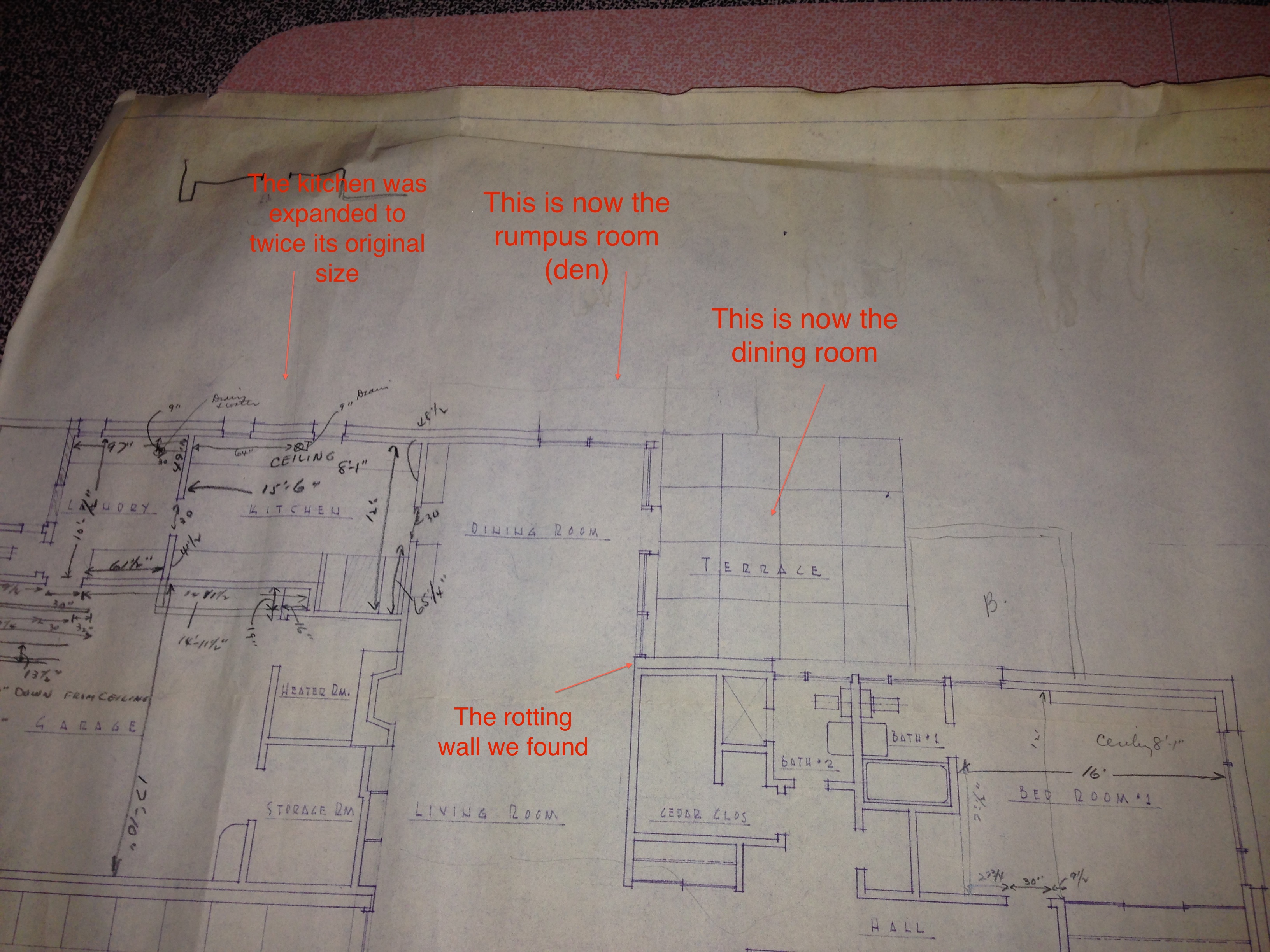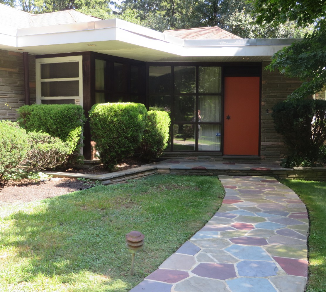

Any fellow “What Not to Wear” geeks will immediately understand the title of this post. Stacey and Clinton have a mantra that they incorporate into every episode: in order for an outfit to be successful, you need to incorporate each of those elements. They don’t all have to play a major role — a hot pink quilted plaid suit with piles of gold jewelry would have all 4 elements, but be overkill. But having at least a hint of each adds visual interest to what you put together. As the design half of this operation, I’ve been keeping those same principles in mind as I plan out how our home will look when it’s finished. It’s a daunting task, especially considering that more than half of the square footage of the house is all open space, but with separate living areas incorporated throughout the flow of that space. The living room, dining room, hallway, and den are all fully visible when you walk in the front door… so everything has to coordinate and flow, without being one-note.
Which brings me to my new obsession, and I can’t believe I’m about to type this… I have fallen madly in love with wallpaper. Oh my god, do I love it. I have always hated wallpaper, for my entire life — it just always screamed “old fashioned, and not in a good way” to me. And when we bought this house, the wallpaper in it confirmed my disgust.
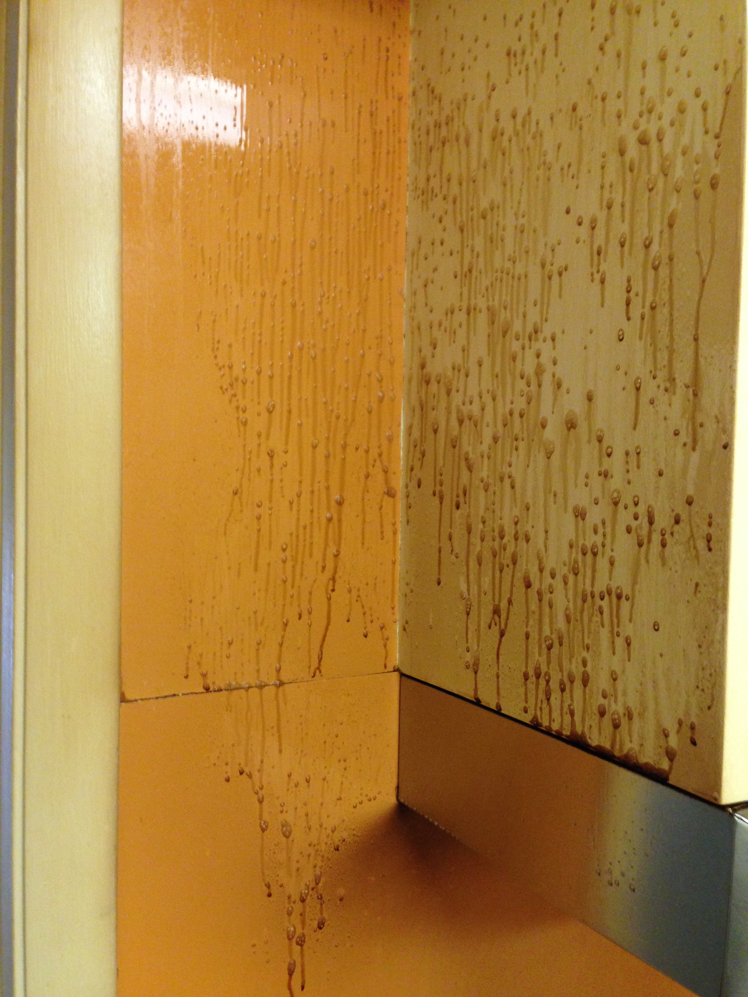
Here’s an example — nasty, ugly patterns in the kitchen.

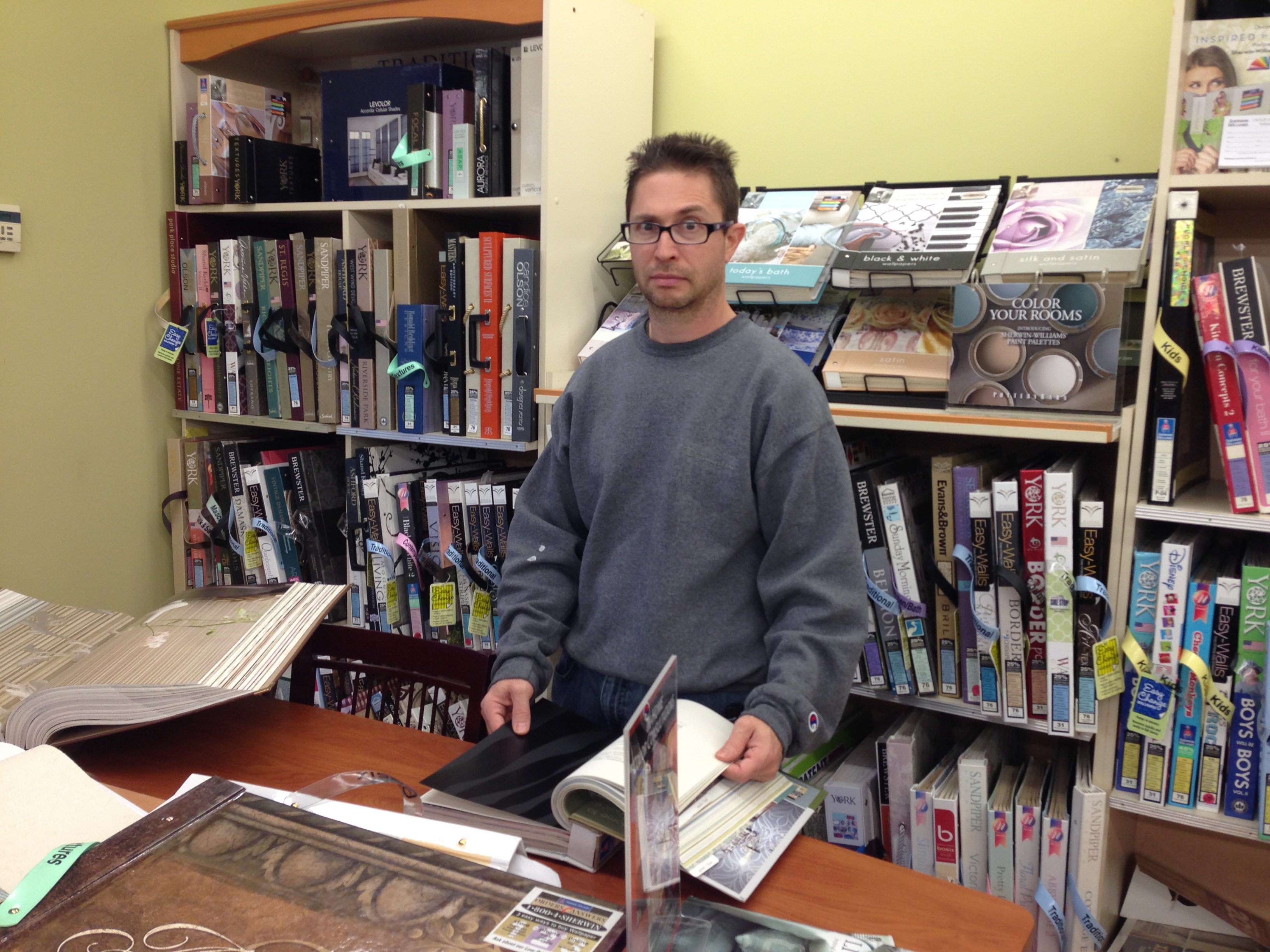
I couldn’t wait to peel this stuff off the walls and cover everything with clean, simple, colorful paint. (Except for the bathrooms — we’re totally not changing the wallpaper in those!) Our painter friend balked and said we should be replacing the wallpaper with more wallpaper, and I was horrified. But to humor him, I agreed to check out the selection at a foofy-foo design place where he could get us a discount. I figured maybe we’d find one or two designs that would work in a couple of the rooms, and we’d still paint the rest like I wanted. So a few weekends ago, we went to the foofy-foo place and spent about 2 hours studying their selection, and it confirmed exactly what I’d feared — everything in their books was exactly what I didn’t want our home to look like. Page after page of paisleys, florals, and plaids. The designs were fine for someone with more classic/colonial taste, but for a modern home they just wouldn’t work. We drove home, accepting that wallpaper just wasn’t going to work because there was nothing we really liked. On the way home, we passed our local Sherwin-Williams and Jack was like, “shall we go in and at least look at their wallpapers?” We had some time, and it couldn’t hurt, so I said why not.
You guys, Sherwin-Williams is a freaking WONDERLAND for wallpaper! We ended up spending the entire afternoon there, giddily camped out with piles and piles of sample books. It completely turned my perception of wallpaper on its ear. Yes, there were plenty of classic designs that we bypassed… but oh my goodness, the modern choices were INSANE. It made me want to buy 10 more houses, because I was so sad I couldn’t buy everything I saw!
Jack says no to the black-on-black zebra print. 😛
Here’s one example of what we were drooling over: a line called “Layers” by a designer named Edward Van Vliet. All of the designs are super modern and graphic, and developed in such a way that you can mix and match everything so it all coordinates as you transition between the various spaces in your home. I mean, look at these amazing combinations together!:
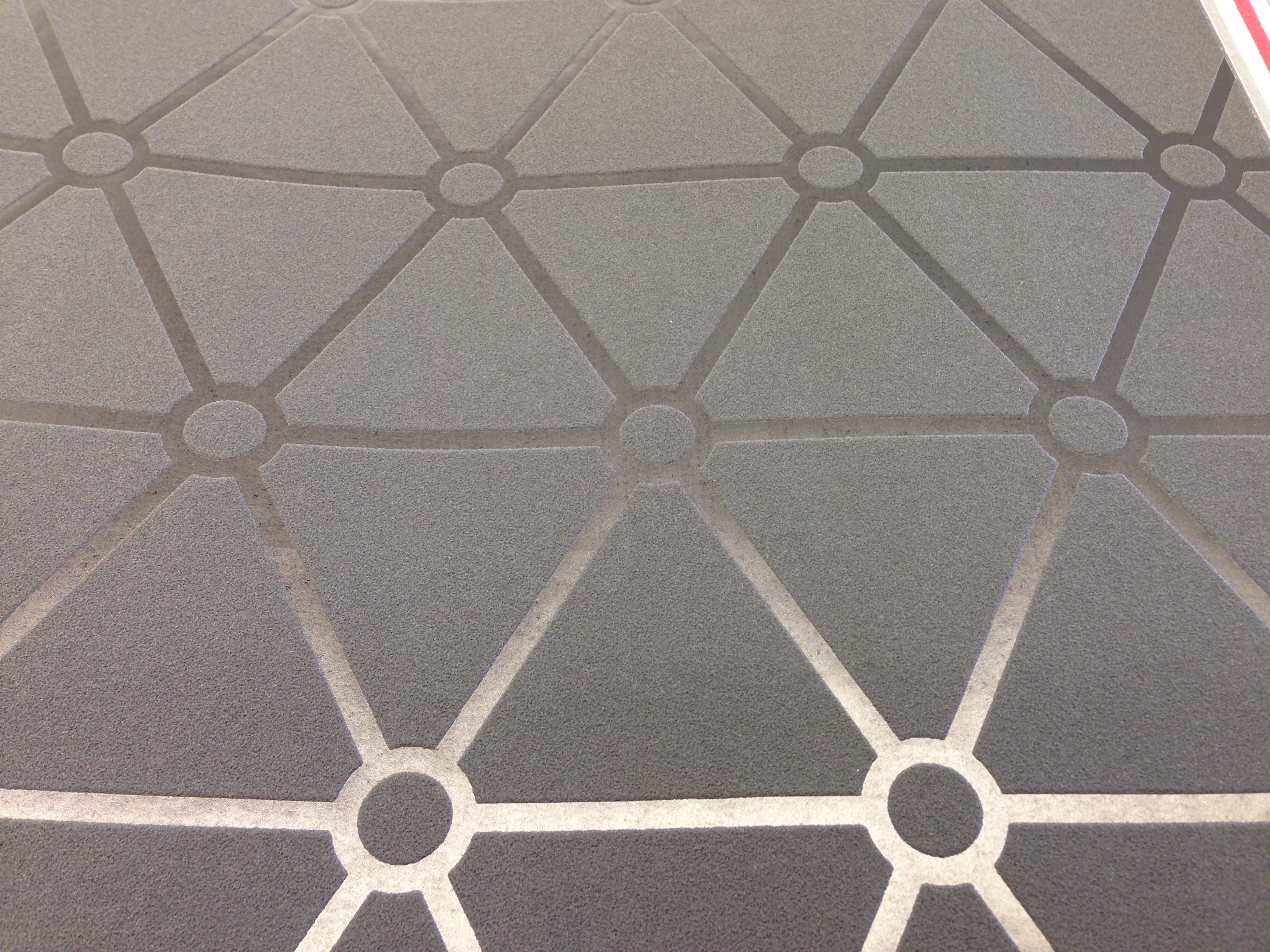
Here’s one color family — gorgeous neutrals, with cream, gray and even an amazing charcoal-on-charcoal gray pattern.

Here’s a closeup of that gorgeous charcoal one. Hard to tell, but the negative space in the pattern is actually slightly raised and textured. Pattern, texture, and shine all in one!
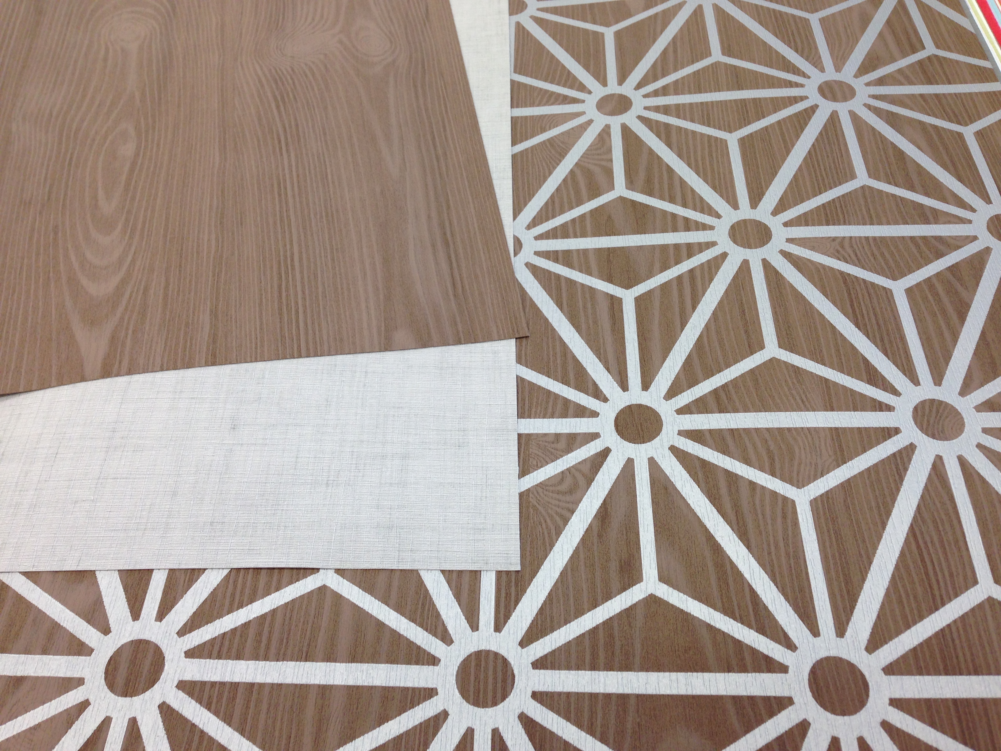
Here’s another series, in more of a natural wood-tone family.
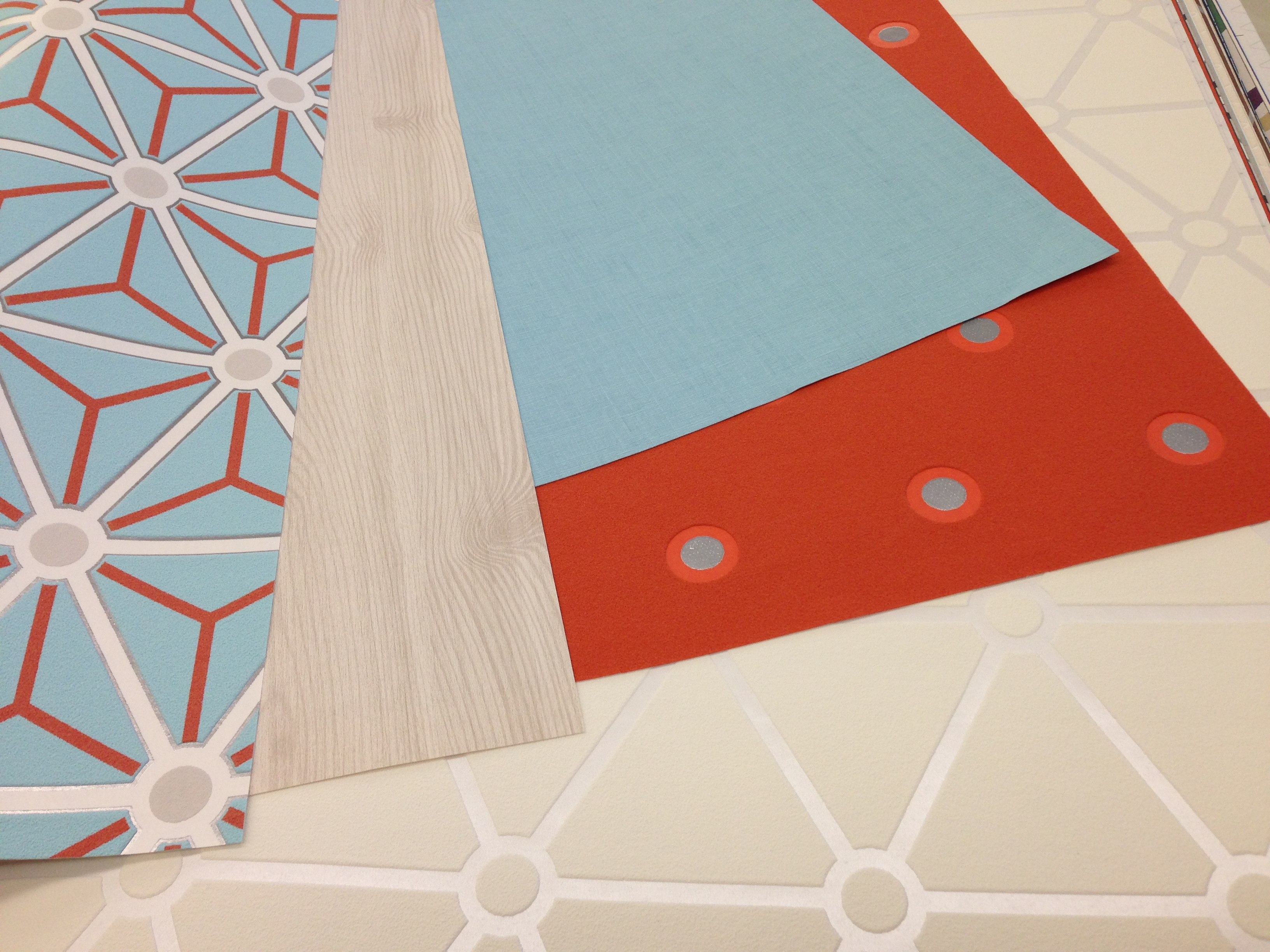
And my favorite color combination: orange and aqua!
Sadly, these papers were just too modern for our house. We were able to select one from this line for our guest bedroom, a lovely simple grayish-cream that looks like linen. But after about 4 hours there, we left having ordered an entire house’s worth of wallpaper!
I’m a total wallpaper convert now. They add another layer of color, pattern, texture and shine to a room that you just can’t get with paint. Thinking about what we’ve picked out for each room, I’m beyond excited because it’s going to add a whole new dimension to each space. We’re not going to share what we’ve chosen yet, because we want to wait until it’s all up on the walls. But in the meantime, the shipments have started to arrive and we’re SO EXCITED!!!!
Hello, my babies! eeeeeeEEEEEeeeeeee!!!!

No lie, when I saw the wallpaper that’s going in my home office, I got so excited I licked one of the rolls. SO EXCITED.
So, yeah! Wallpaper! If you’re redecorating a room, we highly recommend considering it. Or just go to your local Sherwin-Williams to geek out over their selection, it’s so much fun!