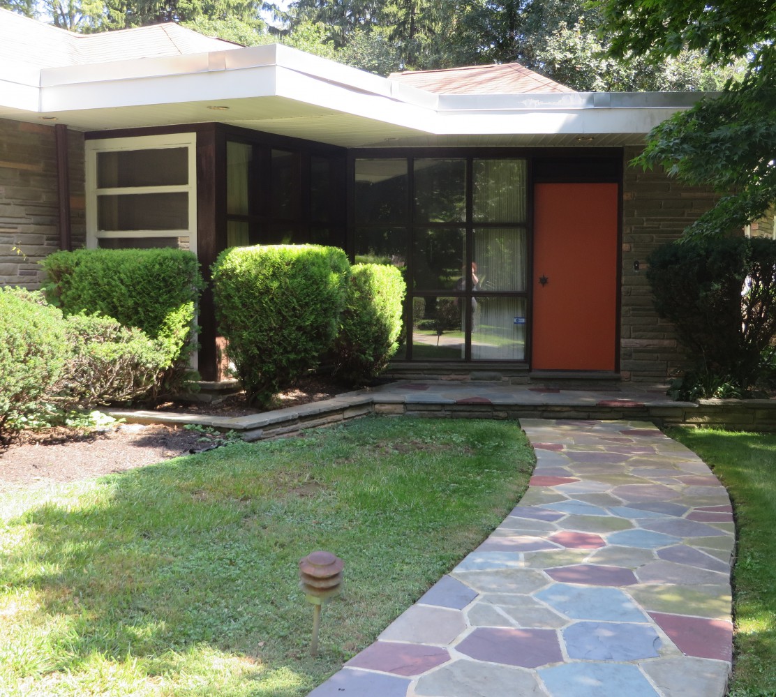
It’s a beautiful Sunday here at Biohazard Manor.* “Sundays with Sinatra” is on the hi-fi, filling the house with music… coffee is brewed, and Jack is cooking up a whole bunch o’ bacon. So it’s time for a long-overdue update, with a feature of the house we’ve been meaning to highlight for a while.
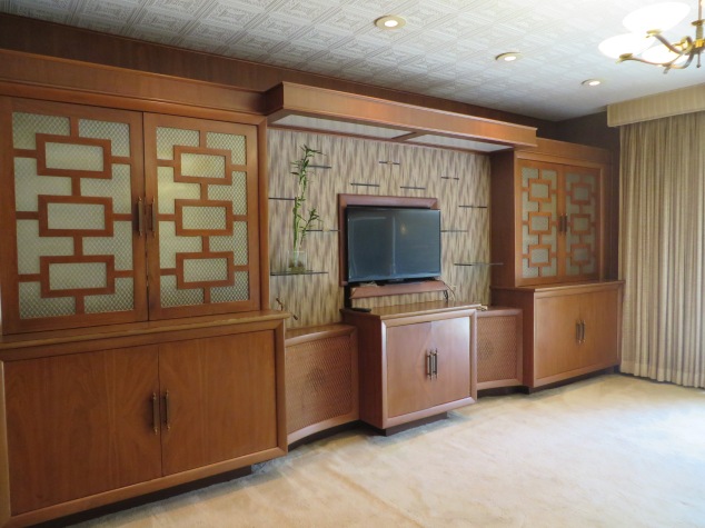
When this house was rebuilt in 1957, the owners were really purposeful in every design element they chose for the renovation. Being the design geek of the relationship, I love how certain colors, fixtures, textures, etc are pulled through from room to room. It really pulls the house together and makes everything a cohesive whole. And one of my favorite design elements they used is, for lack of a better term, rectangles with lines coming out of each side.
You can see it best in the rumpus room built-ins:
Is there a name for this pattern? I’ve seen it every once on a while in mid-century design, and I have no idea if it’s actually called something other than “rectangles with lines coming out of the sides”.
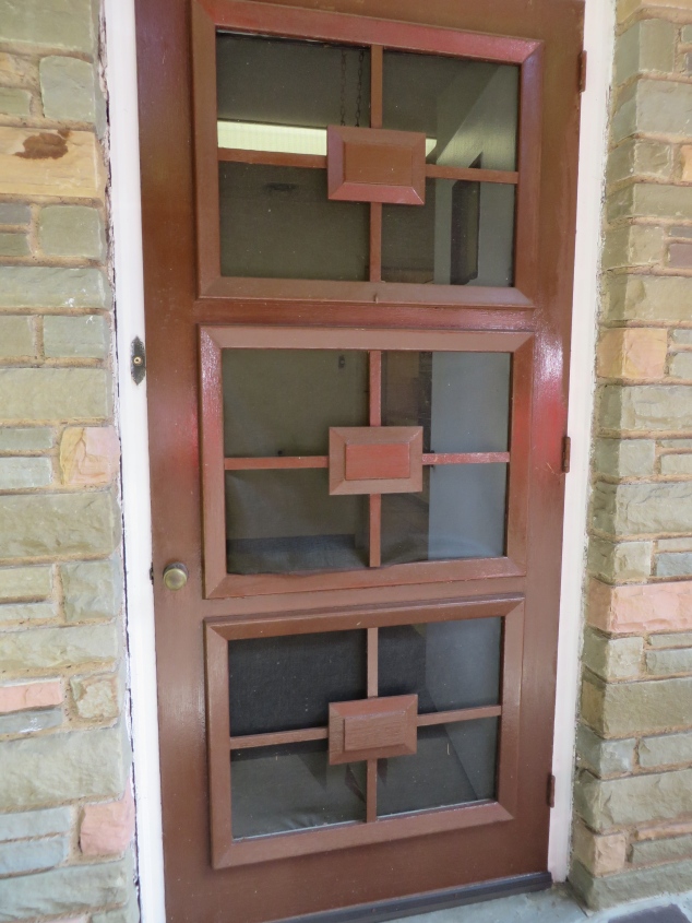
Anyway, it’s in several other places in the house, too. Like the back door:
And it was even used in the structure of a privacy screen in the powder room:
So much fun! Which brings me to a little sneak peek we’ll give of one of the design choices that we made ourselves. I’ll back up for a sec. As we were choosing wallpaper for the different rooms in the house, one thing that was completely stressing me out was the dining room. I felt like I was getting pulled in a bunch of directions — I really wanted something in a medium gray, to tie in with the stone wall that’s caddy-corner across the open living room…
But then, when we were replacing the thermostat on the dining room wall, we uncovered a sliver of the original wallpaper underneath the unit:
OMG, gold foil and velvet flocked wallpaper! Just as crazy as the wallpaper in the bathrooms. I didn’t think I could bring myself to put something that wacky on the dining room walls, but it would be great to choose a design that was a nod to the original. Thus began a weeks-long search for the perfect dining room wallpaper, and it’s amazing that 2 walls’ worth of material could drive me so crazy. Jack and I tore apart every wallpaper book in Sherwin-Williams, with no luck — everything we found was too wacky, or too boring, or too dark (it’s amazing how much dark charcoal wallpaper is out there)… and I Googled like there was no tomorrow, using every possible search combination I could think of: “mid-century gray wallpaper”, “gray foil modern wallpaper”, you get the idea. When I had just about given up, I did a Google search (and I wish I could remember the word combo I used) that pulled up an image that stopped me in my tracks.
Hey, wait a minute…
It’s the rectangle pattern in our house, just going in the other direction!!!!! It was perfect — a not-too-dark gray to complement the stone wall in the living room, with a little bit of shine to give a nod to the original gold foil and velvet wallpaper. The paper arrived a couple of weeks ago, and I’ve been dying waiting for our painter/paperer friend to get around to the dining room and put it up so I could see. Finally, he finished it this weekend, and I’m so excited! I asked him to hang it horizontally so it would exactly match the recurring pattern in the house:
eeeeeeEEEEEEeeeeee!!!!!
I know this is totally jumping the gun, that when most people blog about their renovations they do a big before-and-after reveal, but I have no patience so I’ll post a peek now. Here it is from far away, which makes the pattern seem more subtle:
I’m so happy with how it’s turning out. Now granted, we have no furniture or decor for the dining room, so the paper is all that will be in there for a while. But I’m so glad we were able to pull those rectangles in, in a fun way. And again — if anyone knows if there’s an actual name for that pattern, let us know!
*Yes, we’re still calling it Biohazard Manor, because it seems like every hour we’re discovering yet another surface that needs to be scrubbed. We figure we’ll finally finish it all once we’re ready to move in 30 years.


Love the wallpaper and was holding my breath to see if you hung it horizontally, which YOU DID! How cool is that??
LikeLike
Hee! Great minds think alike!!!!
LikeLike
That was a VERY popular design in decorative concrete screen block too…which is all over the place around here in the Southwest. I have no idea if this is the real actual name or not either – but this block retailer calls it ‘Mar-Jan’ – scroll to bottom of page to see
http://orco.com/pr_screen.htm
This block seller has a more square design (not as rectangular) and they simply call it ‘square in square’
http://www.a1block.com/screenwall.php
At any rate your wallpaper is fabulous….SO cool that you did it sideways too!
LikeLike
Thank you!!! I’ll have to call them and see if they can shed some light!
LikeLike